Years ago, when I was a schoolboy, in particular when it was a cold, wet winter's day, my mother would stop me on my way out of the door, look at how unsuitably dressed I was, and make it clear that if I went out dressed like that I would be sure to catch my death! This is a saying that dates back to the seventeeth century: my mother was born in the 1920s and her lessons in life and childcare skills were largely handed down from her mother from generation to generation, as was and still is the case for many families. As I got older, I managed to fob her off; but was she right?
 Read the following. Then ask yourself, where have you heard the same thing recently?
...is a viral infectious disease of the upper respiratory tract that primarily affects the nose. The throat, sinuses and larynx may also be affected. Signs and symptoms may appear less than two days after exposure to the virus. These may include coughing, sore throat, runny nose, sneezing, headache and fever. People usually recover in seven to ten days, but some symptoms may last up to three weeks. Occasionally those with other health problems may develop pneumonia...spread through the air during close contact with infected people or indirectly through contact with objects in the environment, followed by transfer to the mouth or nose. ...The symptoms are mostly due to the body's immune response to the infection rather than to tissue destruction by by the viruses themselves.
There is no vaccine... The primary methods of prevention are hand-washing; not touching the eyes, nose or mouth with unwashed hands; and staying away from sick people. Some evidence supports the use of face masks. There is no cure....[
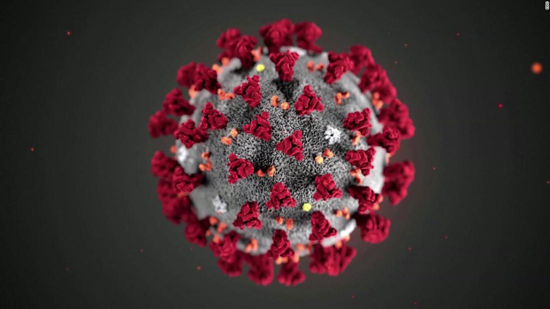
It comes from the Wikipedia article on the common cold, but with a few minor changes it could be describing Covid-19. The take-home message is clear, viruses (in the case of most colds they are caused by rhinoviruses (think rhinoceros: Greek for nose and horn) have been around a long time and they aren't likely to give up any time soon. Moreover while our immune system can deal with some viruses, it is clear that in some cases we will catch our death! In order to meet the challenge of these molecular parasites we need to understand a little about their way in which they spread through populations.

 James (my PhD student) kindly produced a simulation of bacterial growth for me this morning (shown left) in which the doubling time is set at a range of theoretical times from 5 to 30 minutes (for illustrative purposes). The important point to note is that the lag phase and the steepness of this curve is a function of (is directly related to) the replication rate of the organism (another way of expressing the doubling time). The graph could be used to show how temperature influences growth rate, availability of nutrients or types of nutrients, pH etc. It could also show how individual species in a mixed culture grow at different rates. In other words the approach to the "exponential phase" and the steepness of this phase are two of issues that the Government's Chief Scientist and Medical Officer were Government in trying to delay the peak of infection.
In the context of the spread of Covid-19 infections, the axes on the Government plot are numbers of infected individuals (y) versus days after the initial report of the outbreak (x). As I am sure you can appreciate, one infected person will infect a number of others, in a manner that is dependent on the frequency of personal encounters, the length of time of those encounters and the immunity of the individuals in that group. For every type of virus, there is a so called viability factor often expressed in days, which relates to the time dependent decay in the infectivity of an isolated virus particle as it sits on a particular surface. It seems that viruses last about twice as long on a solid surface compared with clothes, and the general consensus published in the New England Journal of Medicine is that infectivity lasts for a maximum of 72 hours.
When these and some other less critical factors are combined, predictions can be made about the rate of spread of the virus and its likely progression throughout a community. In the early stages, where no immunity exists (no vaccine and a new virus), the lag phase will be short and the exponential phase will be steep. In order to flatten the curve, the Government (in the case of the UK) have introduced a series of increasingly stringent public order measures. As you will see from the two curves (flat and sharp) the area under the curves is approximately the same. The Government's public isolation measures are not likely to reduce the total number of individuals infected significantly, but rather to slow the pace of the spread. The reduction in cases will follow as a level of herd immunity develops. The main purpose of the Government measures is to make it possible for the healthcare sector to manage the outbreak in the most effective way, and hopefully this will reduce the number of deaths. I was first made aware of the need to flatten peaks when I saw the graphs of electricity usage during televised events like a major cup final. Everyone puts on the kettle at half-time! Interestingly, the shift from real time TV to streaming and downloads to other devices has significantly altered public behaviour, and the peak of power usage associated with the prime time TV slot for many years has flattened considerably. Clearly public behaviour is a major factor in limiting the impact of a pandemic episode.
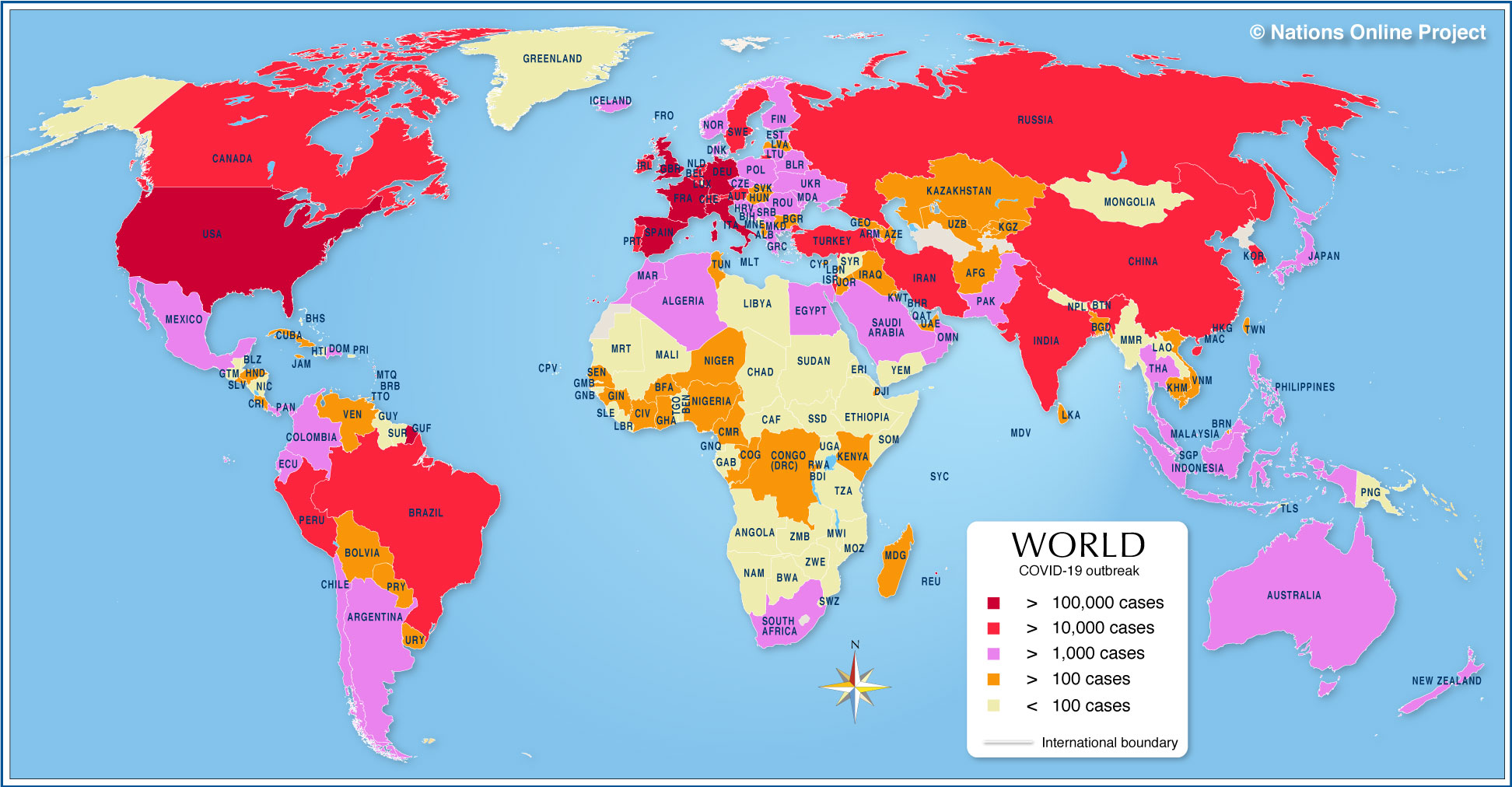 The third phase of the curve is the decline of infected numbers: the moment we are all waiting for and the phase that nobody is willing to predict. The map on the right shows that China, the USA and Europe (in red) are approaching a peak, with African countries lagging behind. This is similar to the difference between bacteria that are slow and fast replicators (see the first graph above). In time the whole world map will be red, the absolute numbers will be a measure of the success of each country's management strategy. If nothing else, this will be the point at which we regroup and put measures in place order to limit the impact of a future pandemic. All of these discussion assume that there will not be a vaccine available to head the virus off at the pass. The reality is (as I discussed in my last post), that novel viruses will always present a major threat to global health and the development of effective vaccines is not something that can be guaranteed, and why I believe this is an area that warrants a major investment.
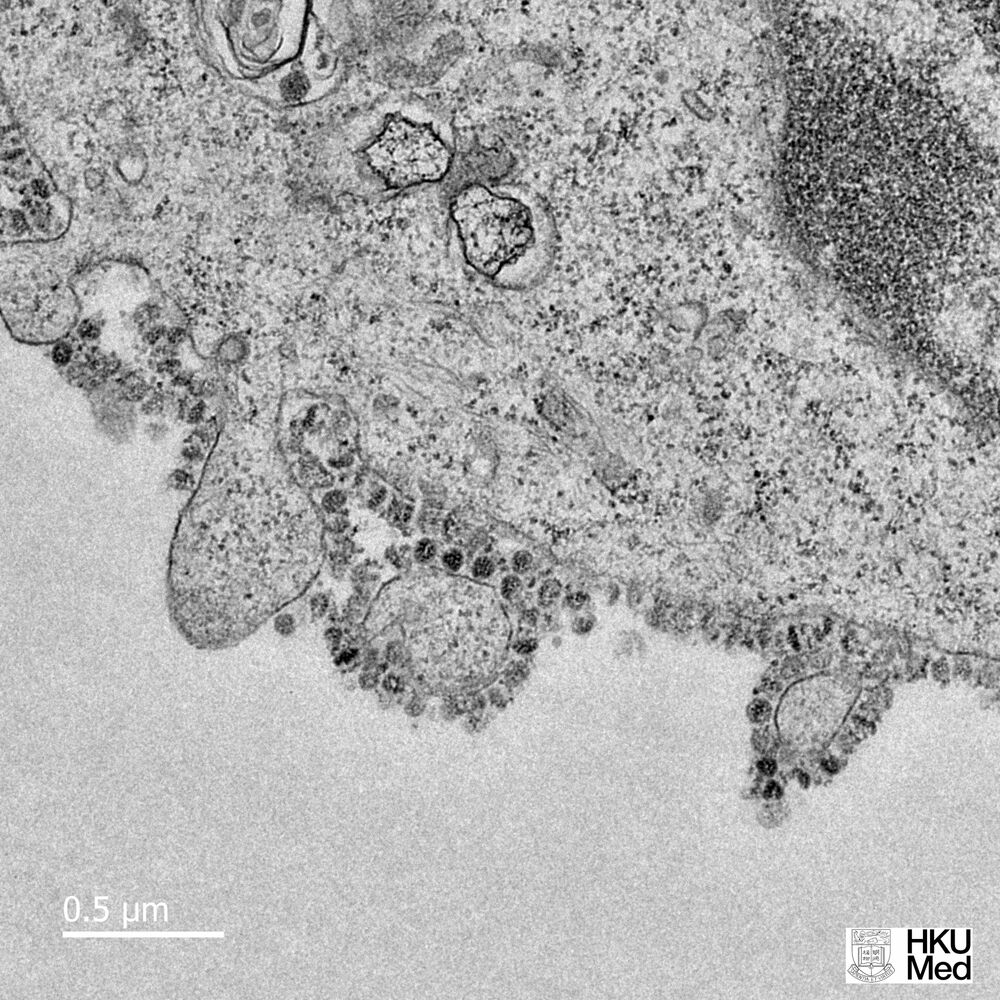
  So returning to the title of the post, how likely is it that your will catch your death from the common cold viruses. The answer is highly unlikely. However, the same is not true for Covid-19, as we are finding out.The most common cause of colds, rhinoviruses were only first recognized as the cause in 1956, by Winston Harvey Price. The virus is not enveloped (see left), like norovirus, and it recognises a cell surface protein called ICAM 1, which you can read about here. The questions that immediately spring to my mind next are
- Can we expect to conquer viruses with antivirals?
- How do viruses evoke different responses in humans?
I shall tackle the first question in my next post and then prepare myself for the challenge of explaining immunological response pathways and our current understanding of why some people have mild symptoms when infected with Covid-19 and for some it is lethal!
Update
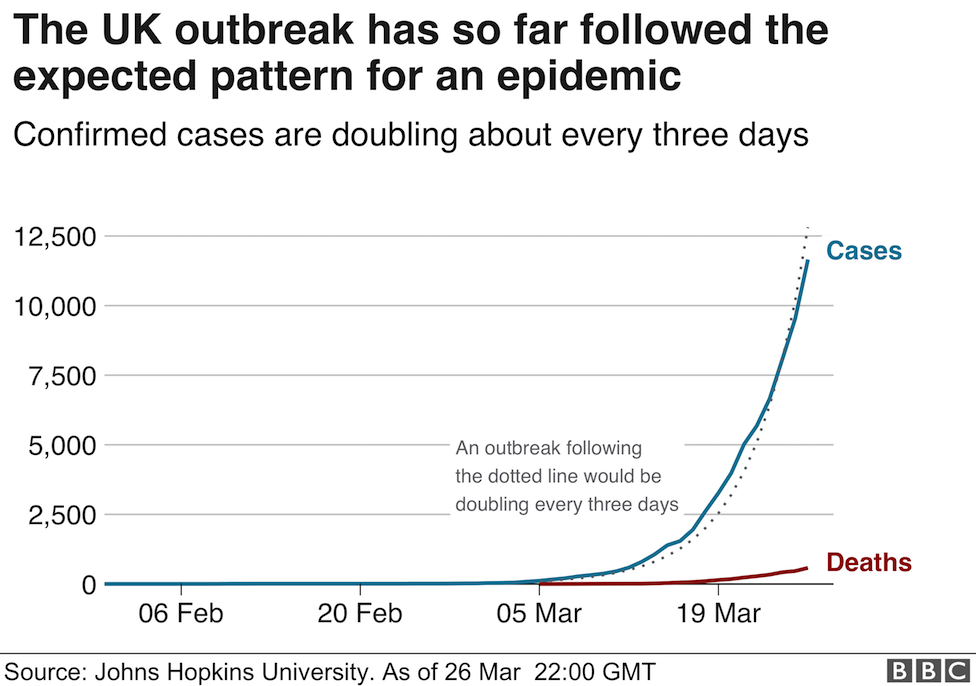
I noticed that on the BBC News website yesterday, there was an explanation of the graphical data (published daily by Johns Hopkins University Epidemiology Unit). They posted two graphs (see below)
Graph 1
Graph 2
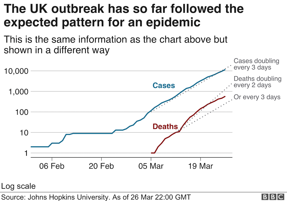
Can you see what they have done to illustrate the time dependent growth of cases? The second graph is a semi-log plot (look here if you need more!)in which the x axis remains linear and the y axis increases logarithmically. As a result the data tend towards a linear relationship (not quite, but with more data it would look smoother). As a student I would use log graph paper and semi log graph paper (with the term cycles used to indicate the number of log divisions) frequently: it made estimating gradients easy: today, the computer has eliminated the need!